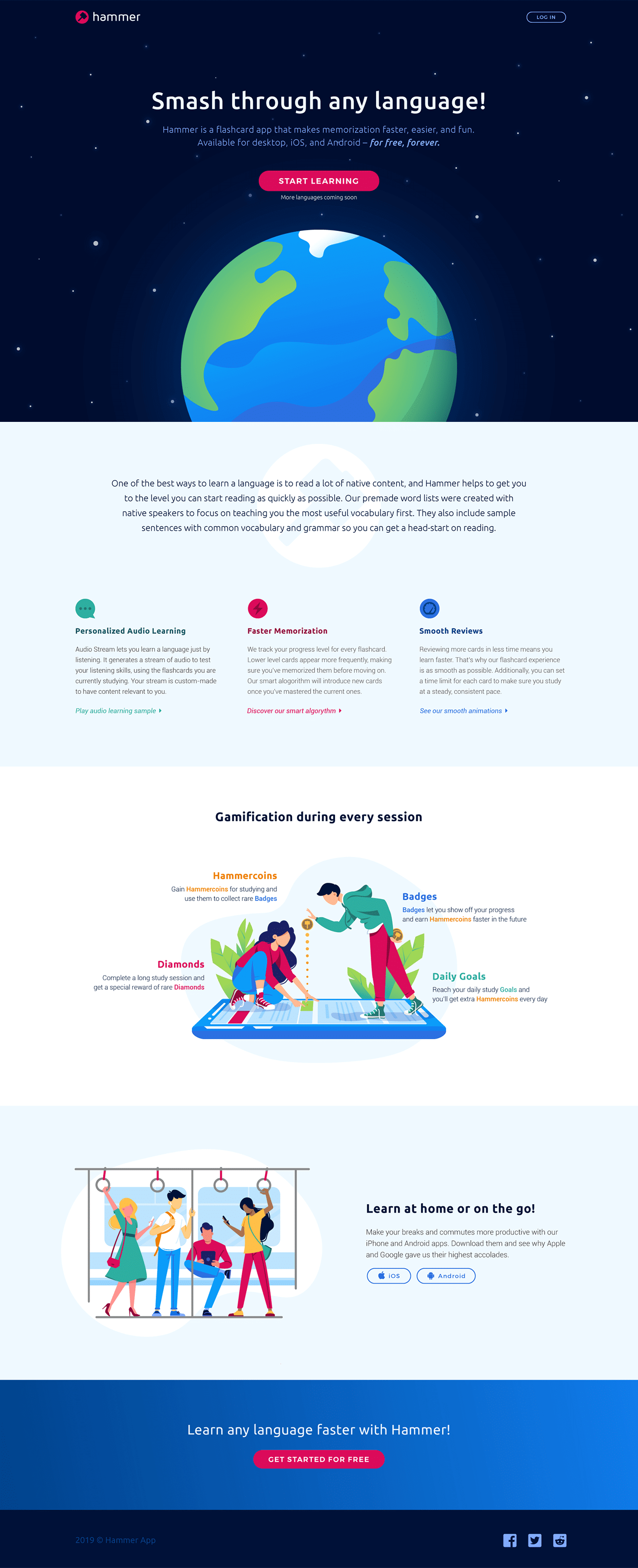
Justin came to us to design a landing page for his language learning tool that makes learning easy and fun through the use of gamification along with a better structured learning program. Anyone that has studied language can know just how daunting of a task it is, meaning we were up against what is potentially a lifetime of bias.
When a user lands on the page, they need to believe that Hammer is the tool that makes learning language faster and easier – the design needs to reflect that and drive sign ups.
The hero section includes encouraging language, a benefit oriented call to action button, and a custom drawn globe all working together to build confidence and excitement in the user as they click to see how Hammer can help them.
For those undecided, the following sections highlight an all new color palette, a redesigned logo, and all the features that make Hammer App unique.