David tasked us with brand development for his line of CBD botanicals. He relied on us to guide him through the process of choosing the name for the company and products, along with the visual identity and packaging design. The goal was a distinctive brand that will help him stand out on the crowded market.
After research, we settled on Recover – a trustworthy name that highlights the medicinal nature of the products.
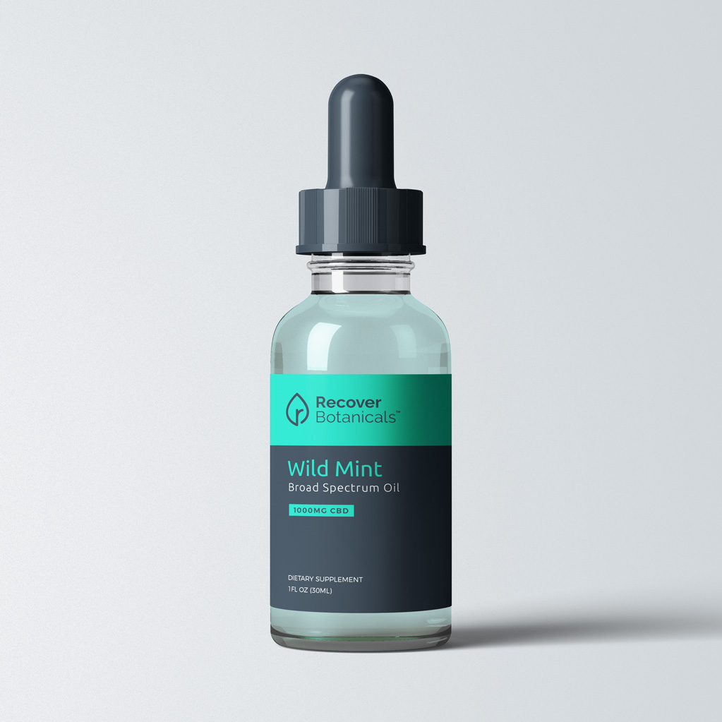
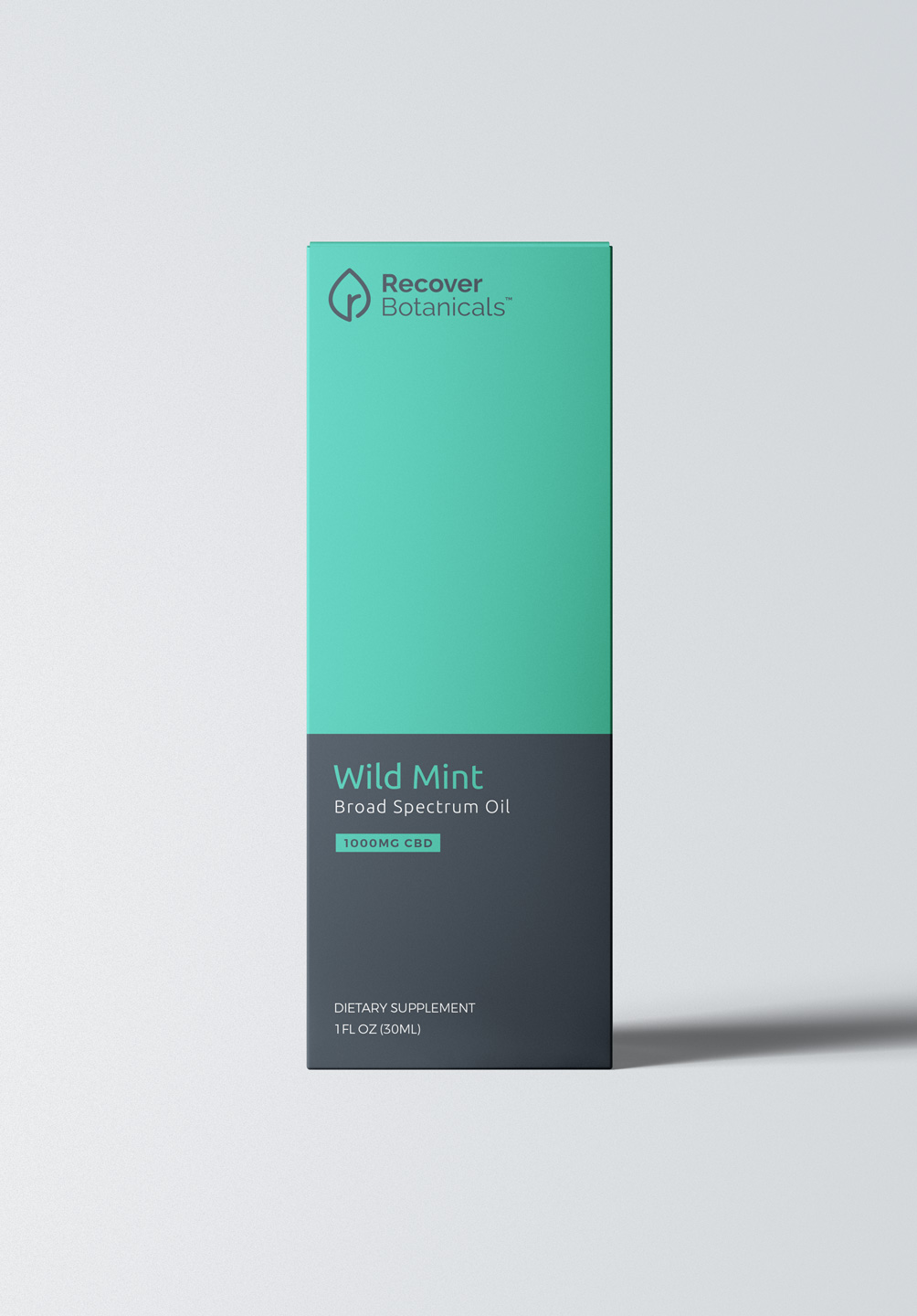
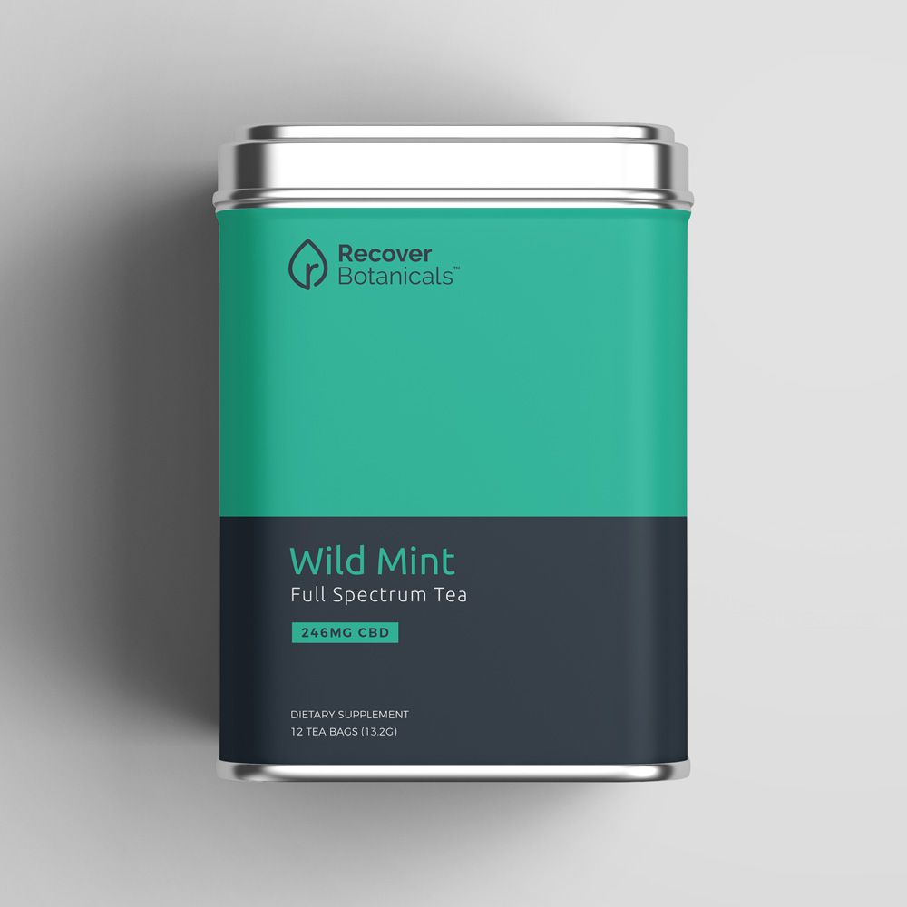
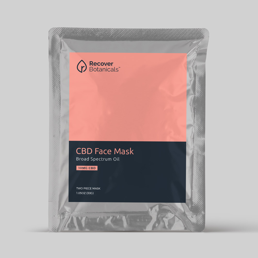
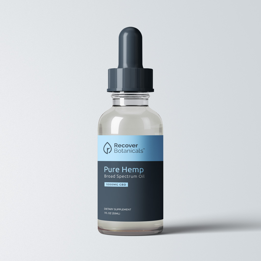
To match the brand, we focused on designing a simple, minimalistic logo. The final idea can be interpreted both as a leaf and a drop of oil, with a lowercase “r” in the middle.
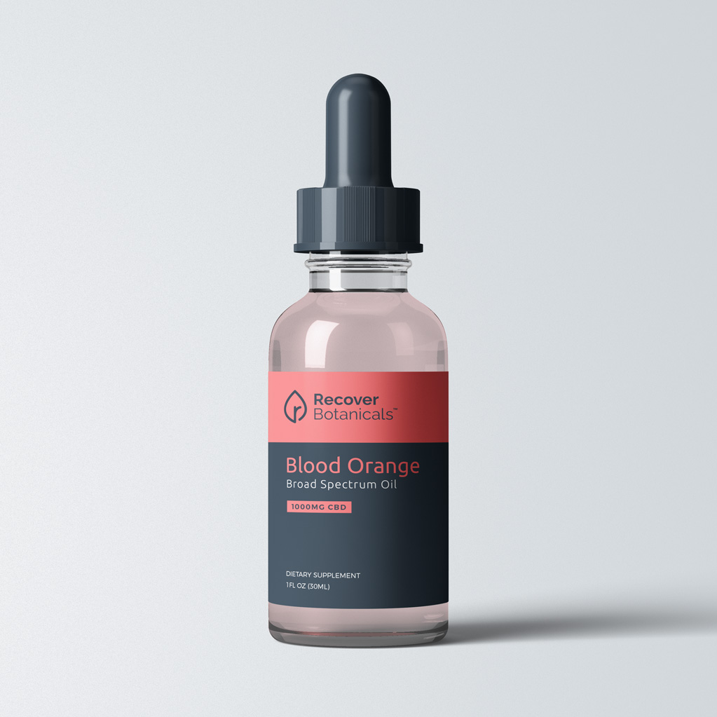
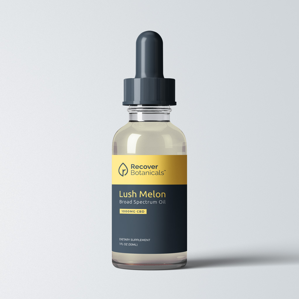
In order to differentiate Recover in a crowded CBD industry, we developed a contrasting palette that highlights each of the individual flavors with a related color. The result is a distinctive, sleek brand that stands out from its competitors.